Retention Product landing page revamp for Chargebee
I contributed to the redesign of Chargebee's Retention Planning page, aligning it with the company's modernized branding. This involved integrating contemporary design elements to ensure consistency across key pages, including Billing and RevRec, thereby enhancing the overall user experience.
Date
Feb 2025
Role
Senior Web Designer
Company
Chargebee
The Challenge and Context Setting
The existing Retention page felt visually outdated and lacked cohesion in messaging. There were gaps between what the product did and how it was being presented.
To get a full grasp of the product, I initiated discovery calls with the Solutions team, PMs, PMMs, and my design lead. My goal was to understand the product deeply and align all stakeholder insights into a clear visual direction.
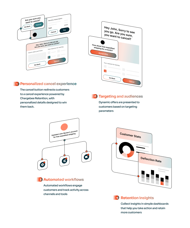
Connecting the Dots
I mapped out a section board to synthesize what Retention really stood for. This meant balancing insights from different teams and piecing them together into a unified narrative.
Design Direction
Instead of following a generic SaaS aesthetic, I opted for a bold, modern, and editorial approach. The layout and color palette were intentionally toned-down to reflect the intelligence and subtlety of the product while still feeling fresh and brand-aligned.
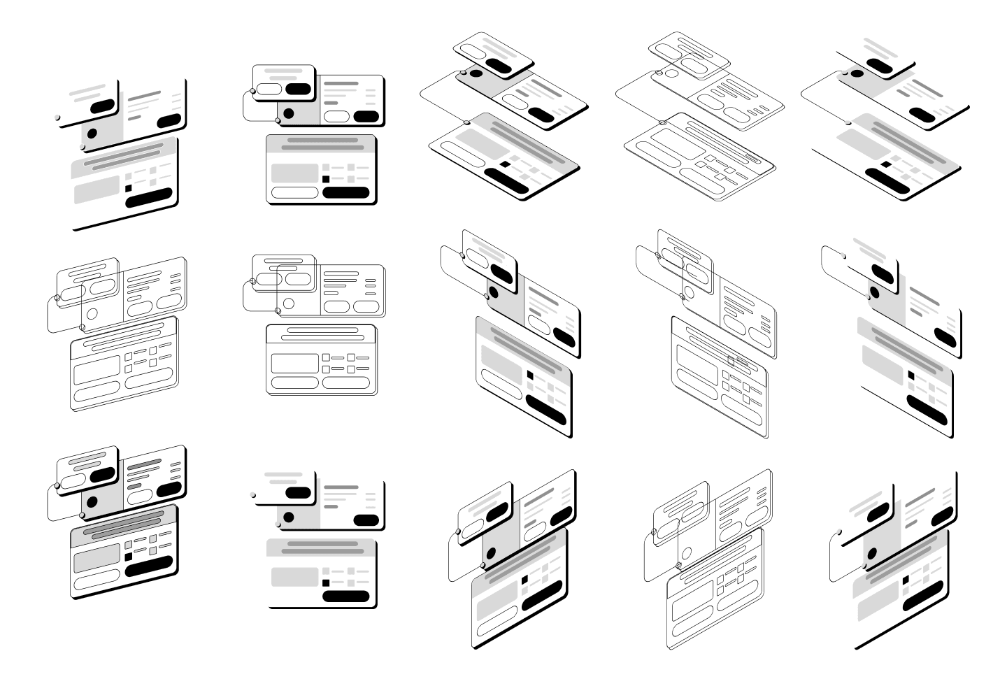
Crafting the Narrative
Engagement Surge: Checkout page visits and simulator interactions doubled within two weeks.
Business Recognition: Awarded GD USA’s Digital Design honor for creating one of the most immersive, conversion-focused marketing experiences.